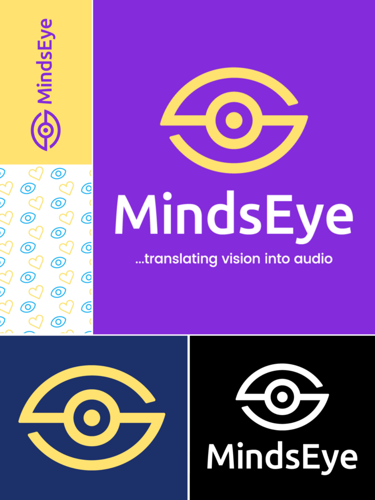
We are thrilled to announce the unveiling of our new logo!

This exciting milestone represents our ongoing commitment to empowering individuals who are blind or partially sighted through the transformative power of translating vision into audio. Our previous logo had been in place for the last 10 years.
As an organization focused on inclusivity, we recognize the importance of breaking down barriers and providing equal access to information, arts, culture, and recreation for all members of society, regardless of their visual abilities. The new logo represents this mission, capturing the essence of MindsEye’s dedication to bridging the gap between the sighted and the visually impaired.
“We are very proud to present our new logo, which reflects our mission of inclusivity and accessibility,” said MindsEye President and CEO Jason Frazier. “Our goal is to empower individuals who are blind or have low vision, and the new logo symbolizes our commitment to breaking down barriers and providing a more inclusive environment for all.”
Designed with thought and purpose by strategic brand designer Somtochukwu Ekpegbue, the new MindsEye logo features a dynamic combination of shapes and colors. The emblem represents how MindsEye helps individuals see the world and bridge the gap of visual communication by translating vision into audio. The prominent eye symbolizes insight and vision: the iris signifies inclusivity, the bridge connecting the lids embodies unity, and the outer edges of the pupil and iris create sound waves.
Beyond the design, the new, vibrant colors denote the diversity of experiences within the visually impaired community, celebrating individuality and unity. The primary color, purple, symbolizes dignity and creativity. It represents the organization’s commitment to dignity and inclusivity for visually impaired individuals. Blue is the secondary color, representing trust, stability, and communication, and is meant to symbolize the organization’s reliability and commitment to accessibility. The color yellow will serve as an accent color, signaling energy, optimism, and warmth to represent the vibrancy and energy within the visually impaired community.
By unveiling this new logo, MindsEye aims to create greater awareness and understanding of the challenges faced by individuals who are blind or have low vision. We believe everyone deserves equal access to essential news and information, rewarding recreation, and artistic and cultural experiences. The logo serves as a reminder of the vital role accessibility plays in creating a more inclusive community. We will integrate the new logo across its branding collateral, website, and social media platforms in the coming weeks.

